
Odds are, if you’re reading this, you’re probably curious as to what responsive web design actually is. Up until now, it has probably been a term or phrase that you’ve seen quite a bit of but still don’t really know what it means. Let us be the first to tell you that a lot of the web design and web development terminology that you’ll see and hear actually means something very simple. But still, in order to implement responsive design on your site, let’s first define responsive.
All web designers, or good ones at least, would define responsive web design as having a well-working and looking website on all devices. That’s a proper mobile layout, tablet layout, and desktop layout. That’s it. In our experience, this is still a very overlooked aspect of web design. So let’s share what we do to avoid this problem.
Consistent design, in terms of responsiveness and layout, can have a better chance to build visual authority with visitors. Think about it, most websites you visit have to have a consistent design. You’ll automatically assume that it’s sketchy if it has an inconsistent design on different devices. And if the buttons on a website take too long to load when they’re pressed, you probably won’t be putting your email address in to receive newsletters or other information. This is the impact of responsive website design.
What is Responsive Web Design
Responsive website design is when a website transitions and functions properly on a desktop or mobile device. Sounds simple, right? Well, because it is. Making this happen, however, is not as easy as you’d think. Let’s say you run a roofing company and someone is on your business’ website using their laptop at home. They’ve been thinking about getting a new roof for the upcoming winter, so they sent their significant other a link to your website. However, when their significant other opens the link on their mobile device, the website’s layout isn’t optimized and looks disorganized. These visitors would probably click on the link, see the disorganized and sketchy layout, and never return to the website again.
This hurts your business’ brand, SEO, and sales altogether. Visitors clicking off of your website so quickly increases your bounce rate, a term that describes how quickly visitors “bounce” off of your website. Search engines can see your website’s high bounce rate, and are less likely to rank your website and content since visitors are already clicking off so quickly. All because the web designer didn’t optimize the page layout for both mobile and desktop devices. Responsive web design is essentially your business’ digital first impression. Images not appearing, pages loading slowly, and bad HTML are all signs that scream “spammy website!” to visitors.
What is an Example of Responsive Web Design
Have you ever visited a website on your phone, and the website moved slower than it did on your laptop or desktop computer? This is an example of poor responsive web design. Responsive web design refers to a website looking and functioning correctly on multiple devices. There are several ways your website design could be unresponsive, so we’re going to take a look at one.
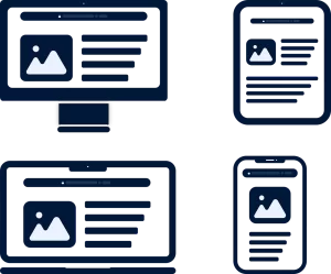
The diagram above represents how a website’s content and layout smoothly transition on each device. The laptop and desktop devices are very similar in what their designs will look like, often more stretched out and wider. Notice how the content and layout on a tablet or mobile device are more direct and concise than on a desktop. The page layout and content don’t automatically do this for you. It’s up to you or your web designer to optimize the UX and UI design for all devices. Visitors access your website through all devices, and according to studies, they access it more through their phones than anything else.
How Do I Make My Website Responsive
Making your website fully responsive is no small task if you’ve already published your unresponsive pages. You will have to go back to see if any design components clash with the functionality of your website. This can be tedious because you may already be accustomed to your website functioning a certain way. This is why using a template or pre-designed layout can be more beneficial than coding or developing because it is far less time consuming and more responsive. With HTML, you will have to go through each individual page and optimize each element by code. While it is still very possible, if you are not an experienced web developer, there is a chance that you could break the page or even the website, so do beware.
Make sure to test the responsiveness of your website on real devices after you have optimized the design. If you use plugins on your website, which most businesses do, make sure to use the quality versions of those plugins so they don’t negatively affect your layout on different devices. Lastly, updating your website and regularly maintaining it will keep your website design responsive and moving quickly. Website maintenance seems very basic because it is, but sometimes it’s so basic that it’s often overlooked.
Components of Responsive Web Design
- Adaptive Images
- Fluid Grids
- Media Queries
Adaptive Images
Adaptive images are another name for adaptable images in responsive web design. They offer visual solutions with no constraints on the display size. This makes image resizing tidy and attractive. Images must be sufficiently large in order to render properly when scaled to larger viewport sizes. The picture will be responsive and scale up or down if the width property is set to a percentage and the height value is set to “auto”.
Fluid Grids
A fluid grid divides a page’s width into smaller, equally sized columns where the content is placed. In order to display the website appropriately on multiple screen sizes, a fluid grid layout offers a technique to design several layouts.
A fluid layout employs relative measurements and adjusts to a viewport’s width, whereas a fixed layout uses static measurements and does not adjust to the width of the viewport.
To keep the layout neat and manageable, a fluid grid will specify a maximum layout size for the design and divide the grid into a certain number of columns. Additionally, it uses proportional widths and heights for each piece.
Media Queries
CSS media queries are one of the most important parts of responsive web design. A CSS3 feature called media query enables websites to adjust their content to the type of media being used to display it. By using media queries, you can offer different CSS styles depending on the viewport’s width or other factors. Additionally, they let you make the page responsive and specify a variety of screen widths. They assist in the definition of breakpoints as well. Additionally, many conditions may be defined.
Applying these practices can be overwhelming and completely confusing to most business owners or even some web designers. Contact us to start your consultation if you’re having trouble getting your website to be more responsive on different devices.